

National NDIS Communications Campaign
Role: Concept, Art Direction, Design and Animation
Client:
National Aboriginal Community Controlled Health Organisation
National Aboriginal Community Controlled Health Organisation
Agency: Rhythm Films
------
Original Artworks:
Kimberley Engwicht / K-Rae Designs, Coree Thorpe, Ailsa Walsh, Tyrown Waigana, Tori-Jay Mordey
Kimberley Engwicht / K-Rae Designs, Coree Thorpe, Ailsa Walsh, Tyrown Waigana, Tori-Jay Mordey
Mello
Creative Direction – Lance Clayon, Brad Chandler
Design – Lance Clayton, Brad Chandler
AE Animation – Lance Clayton, Brad Chandler, Matt Lukins
Compositing - Lance Clayton, Brad Chandler
Executive Producer - Isabella Cooper
Frame-by-Frame – Brad Chandler, Matt Lukins
Rhythm
Creative Director / Art Director: Stef Langton
Executive Producer: Candice Shields
Director / Photographer: Matt Sav
DOP: Lewis Potts
DOP: Jack Shepherd
1st AC: Dan Stone
1st AC: Jason Vanstone
Sound Recordist: Richard Hubbard
Sound Design: Ned Beckley @ Envelope Audio
Creative Director / Art Director: Stef Langton
Executive Producer: Candice Shields
Director / Photographer: Matt Sav
DOP: Lewis Potts
DOP: Jack Shepherd
1st AC: Dan Stone
1st AC: Jason Vanstone
Sound Recordist: Richard Hubbard
Sound Design: Ned Beckley @ Envelope Audio
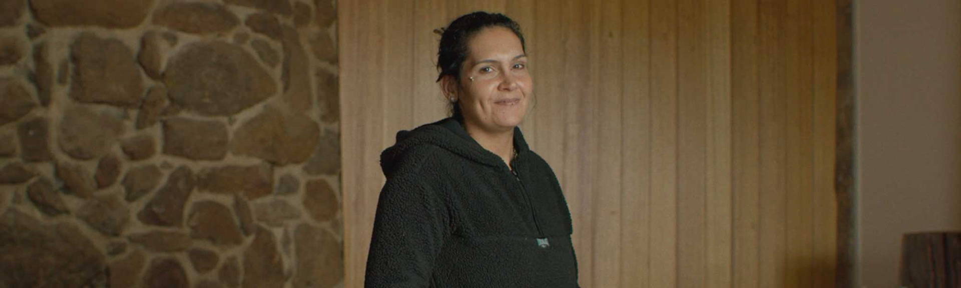
Mello was approached by Rhythm Films to develop visual concepts, design and animation for a suite of content pieces using five artworks created by Aboriginal and Torres Strait Islander peoples, paired with five unique personal NDIS stories told by First Nations people with a disability.
The lower involvement levels of Aboriginal and Torres Strait Islander individuals in the NDIS has resulted in unnecessary hardships. One contributing factor has been the lack of promotion directly targeting Aboriginal and Torres Strait Islander communities.
The brief aimed to share the personal stories of Aboriginal and Torres Strait Islander individuals, who have been working with the NDIS to improve their lives and their prospects for a happier and safer future. To share these stories, wrapped in beautiful design and animation, was a delight.
Rhythm commissioned five Indigenous artists to create five unique artworks - each one representing a specific participant's story. It was then Mello's pleasure to use these artworks as inspiration to create animations that bonded each story to the artwork.
We were delighted to have recieved a Silver AEAF Award for our spot 'Kallara'.
We were delighted to have recieved a Silver AEAF Award for our spot 'Kallara'.
__________________________________________________________________
Mello was asked to bind each of the stories to the artwork, and using design and animation, accompany each story with a moving, animated, visual interpretation.
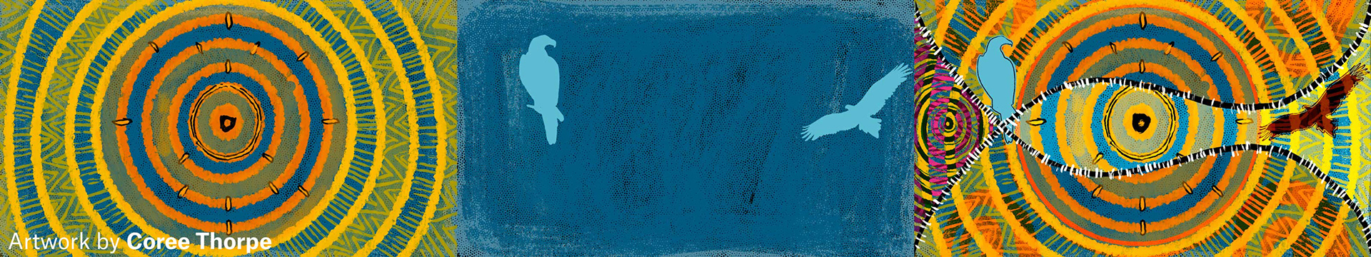
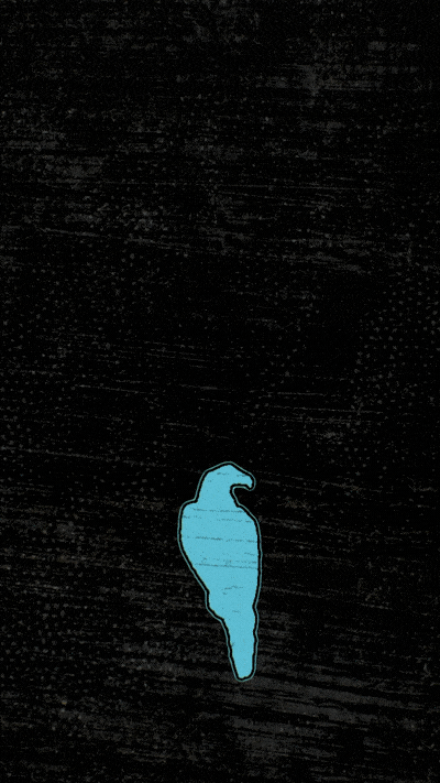
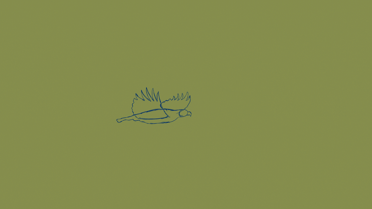
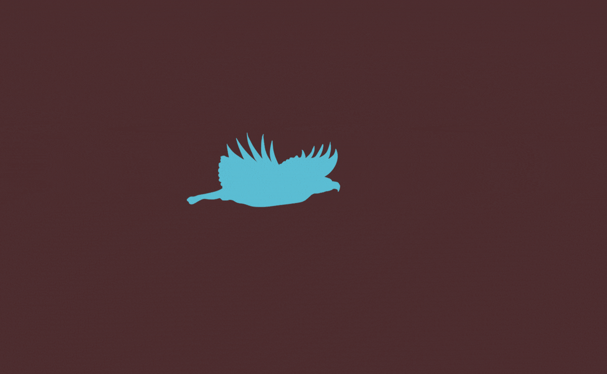
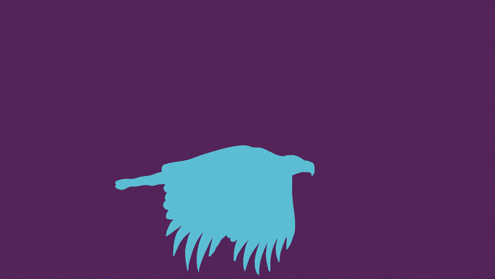
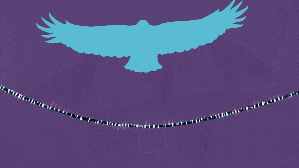
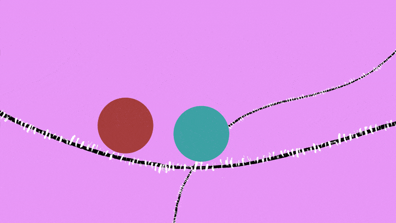
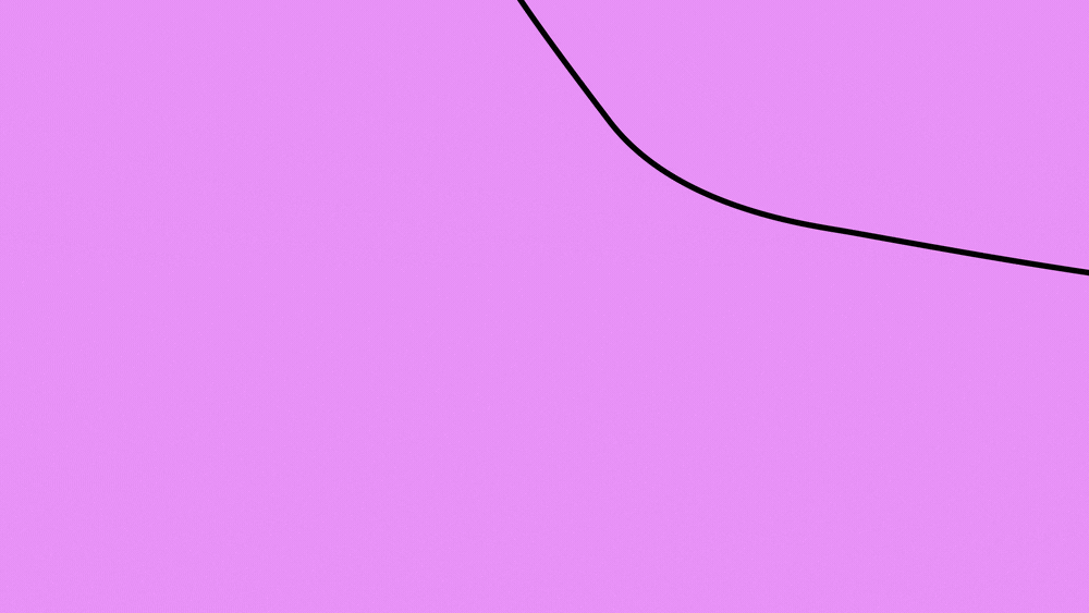
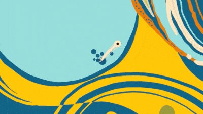
Kallara's story.
Original artwork by Coree Thorpe
__________________________________________________________________
'Kallara LAYER - this layer simply represents Kallara during understanding her disability and learning how to navigate and get help ultimately through NDIS.
As you can see there’s ups and downs just to represent the flow of how hard days can be and others not so.'
Coree Thorpe
__________________________________________________________________
We took a conceptual look at each of the commissioned artworks, along with their stories, and built storyboards that represented the personal journey of each participant, visualised through scenes that were inspired by, and derived from, elements and features of the hero artistic pieces.
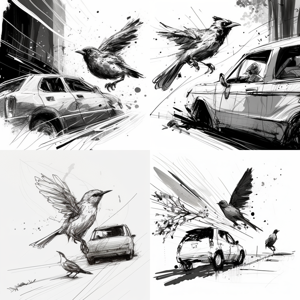
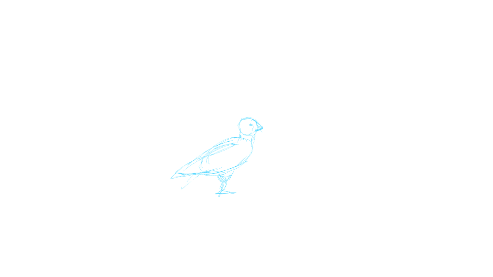
For Kallaras spot, we took a hero element of the design - the Wedge Tailed Eagle - and utilised it in a metaphorical portrayal of Kallaras empowering experience with NDIS.
For Kallaras spot, we took a hero element of the design - the Wedge Tailed Eagle - and utilised it in a metaphorical portrayal of Kallaras empowering experience with NDIS.
Due to the bespoke nature of each of the artworks, we had to approach each spot as a completely new endeavour stylistically. To come up with 5 spots that felt unique in approach was certainly a creative mountain to climb, but furthermore we had to ensure that the designs were an extrapolation of the original artists works - careful to derive almost all assets from somewhere within the original artists artwork. The last of the triad of challenges was to then connect the feeling of the stories to the tone of the artworks through the way that things moved; animation - the final piece to the puzzle.
You know that the project has become a personal investment of love for the artists when peppered throughout are easter eggs - such as a lovely brotherly fishing moment hidden as a substory and the original artwork by Ailsa Walsh-Davidson hung upon the wall of Jason's living room.
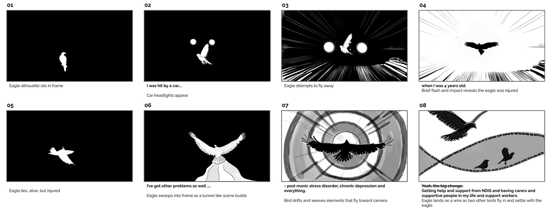
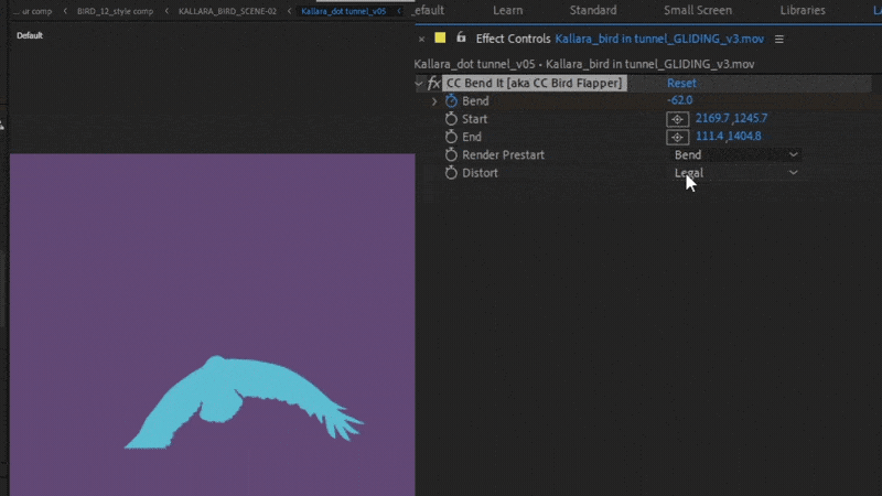
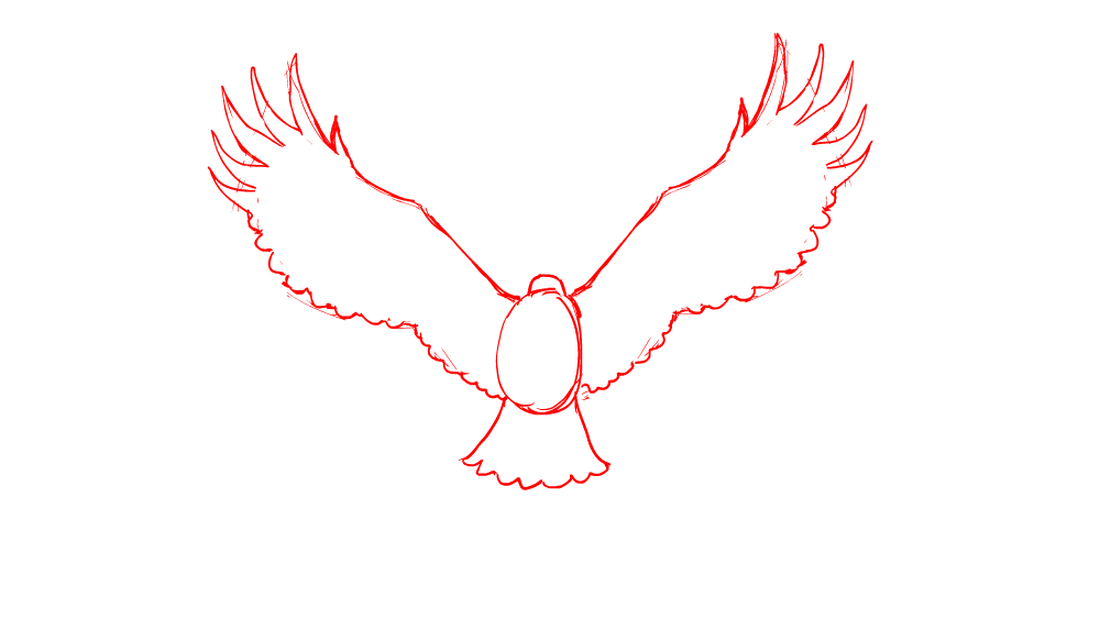
Using mixed techniques that traversed traditional sketching, procedural AI, cel frame, After Effects animation, and mind bending layers of compositing - Kallara shines as a beneficiary of the love imbued by the whole Mello team and their skill sets.
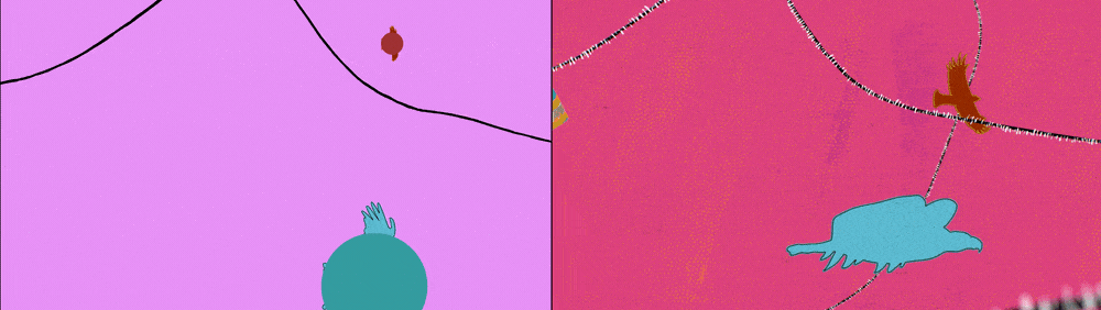
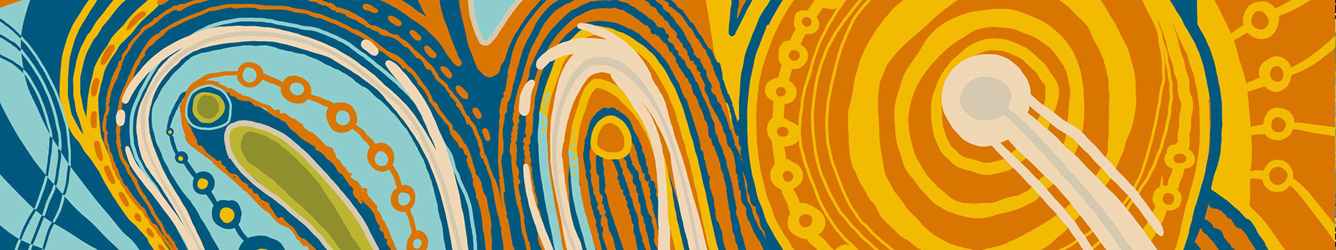
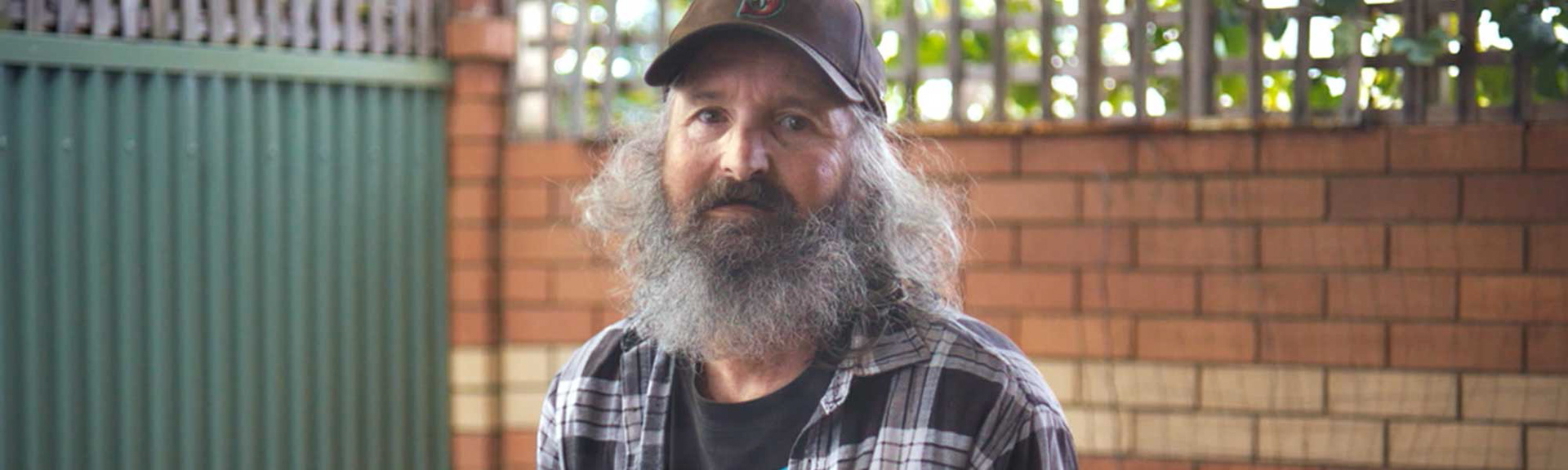
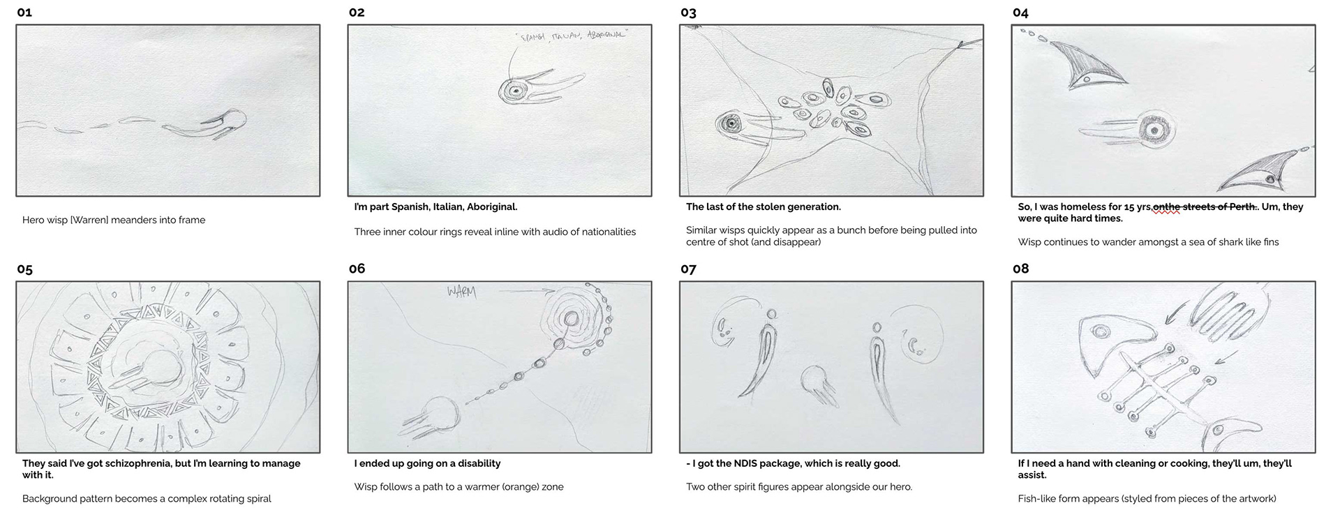
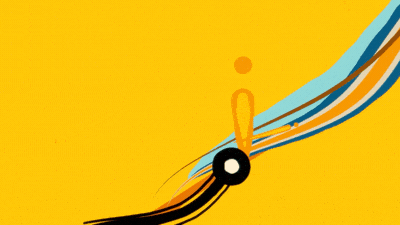
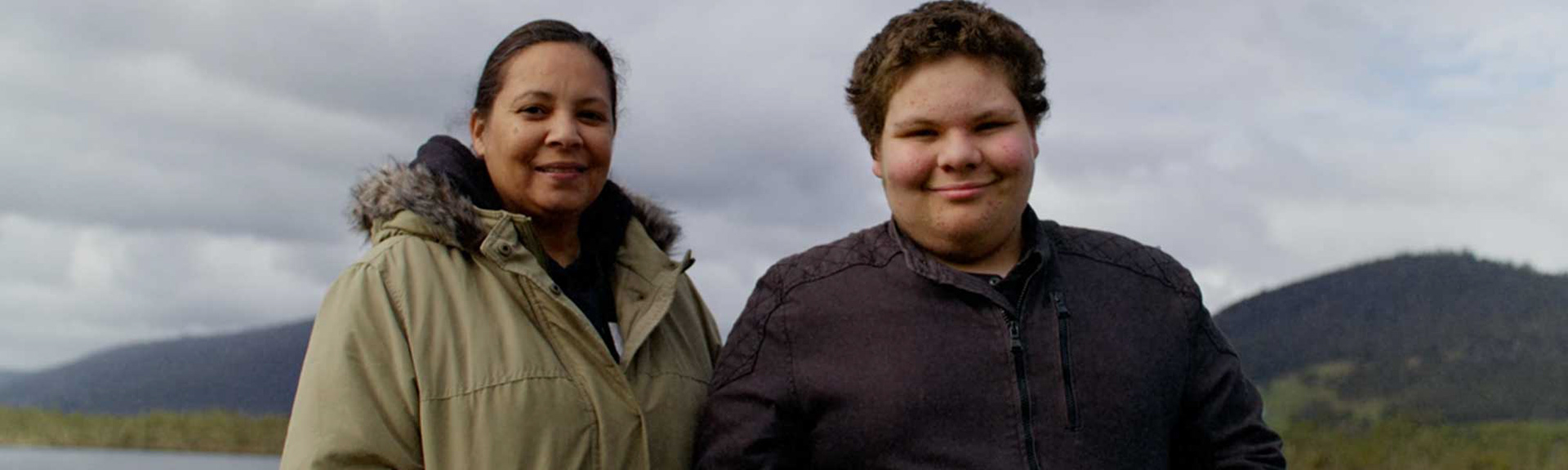
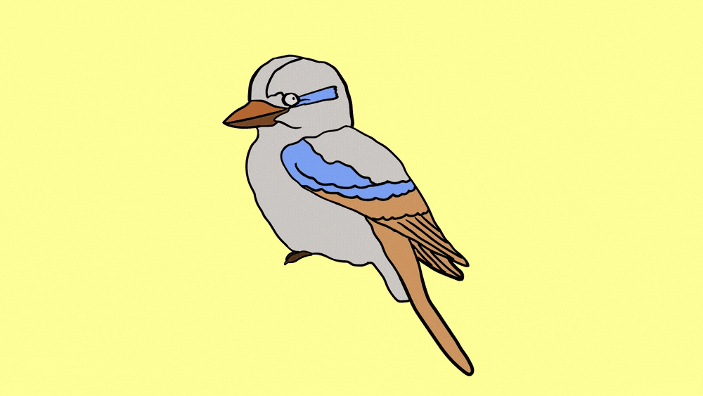
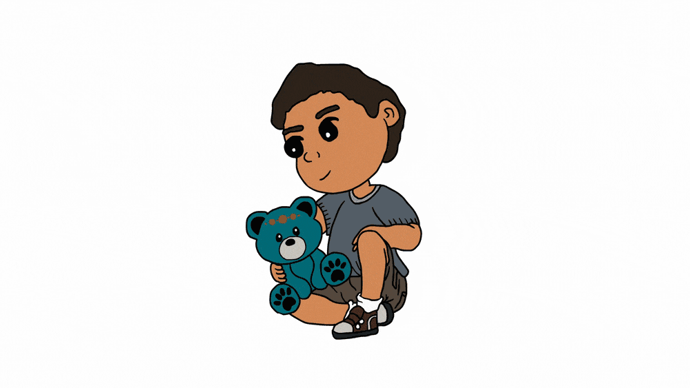
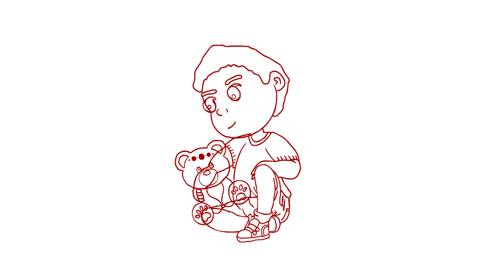
Warren's story.
Original artwork by Tyrown Waigana
__________________________________________________________________
'I used blue on the left because of its cooler colour, the circle is smaller and I used triangles to suggest things a little more volatile at this point in Warren’s life.
Then going into a big orange circle because it’s a warm colour and things a little easier, his life is fuller and more complete.'
Tyrown Waigana
__________________________________________________________________
The beautifully complex nature of the artwork from Tyrown Waigana for the Warren story was initially confronting; to conceptualise scenes that could honour the diverse, layered artwork once in animation was no small feat. We chose to draw from the form of the 'story lines' in the artwork to pull out hero figures that we called 'wisps' around the studio.


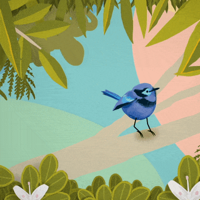
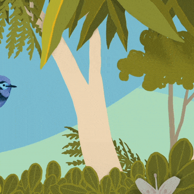
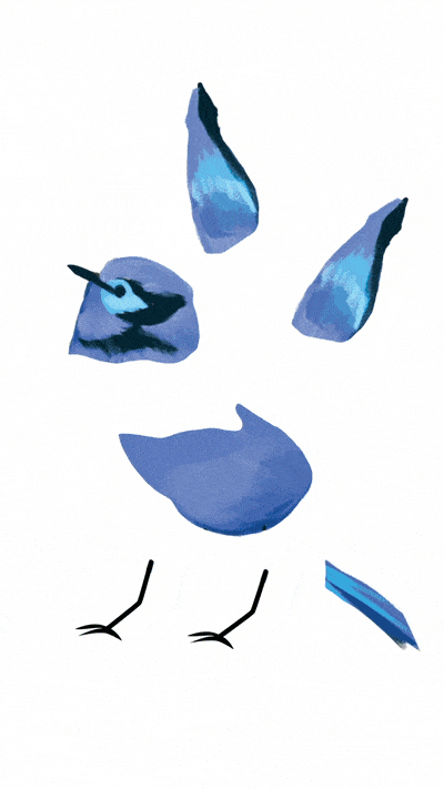
Momo & Sarah's story.
Original artworks by Tori-Jay Mordey
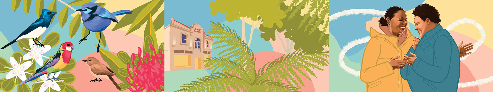
The artwork for Momo's story is stunning. We broke apart the beautifully textured birds into elements that could be rigged for animation, and filled the scenes with lush leaves and branches. The jittery movement of the birds is something that we're particularly proud of. Given the realism imbued into the artwork by Tori-Jay, it seemed important to us to animate them in a way that replicates the natural movements of small birds - quick and sharp.
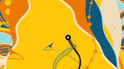
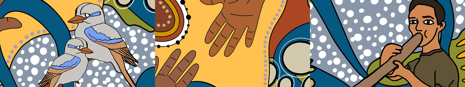
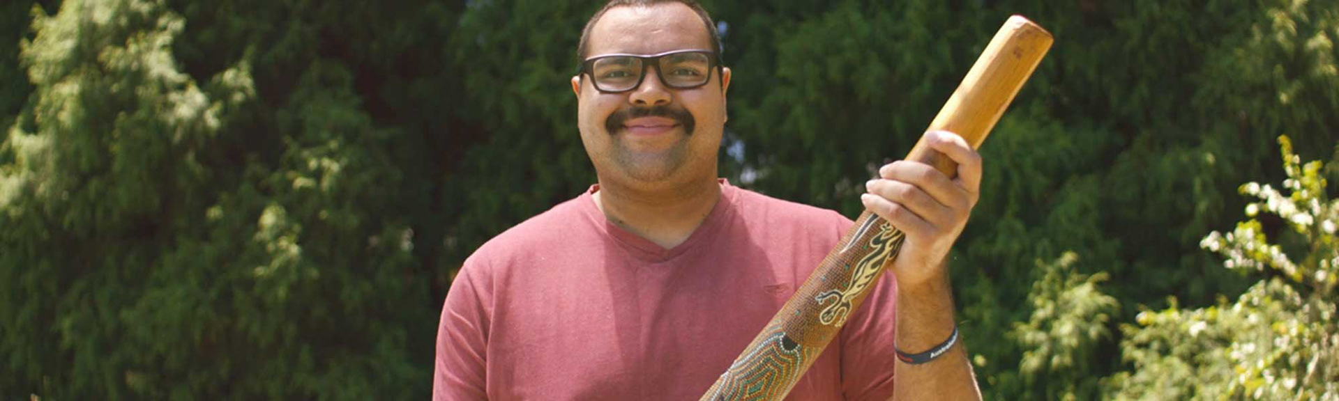
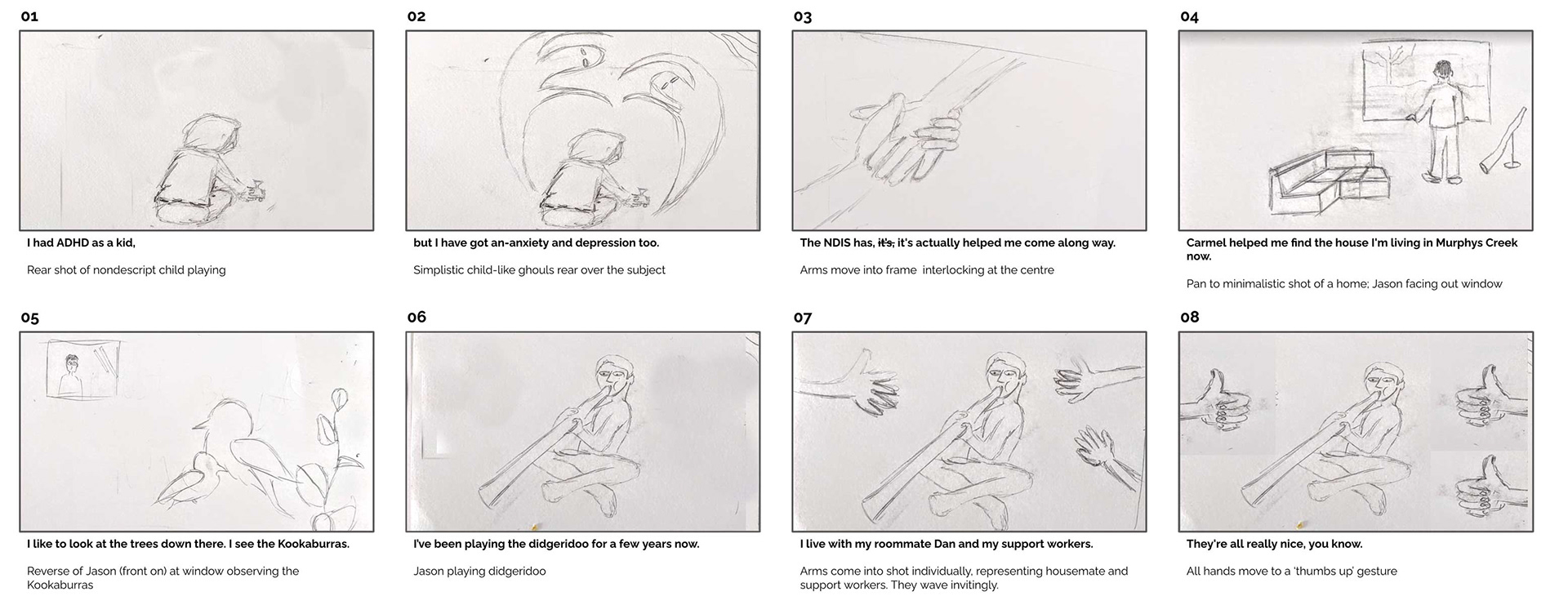
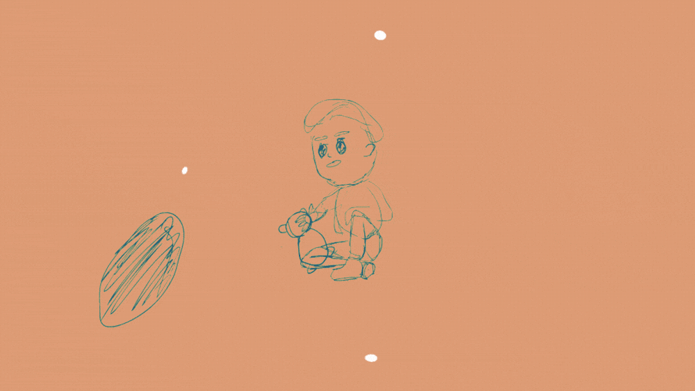
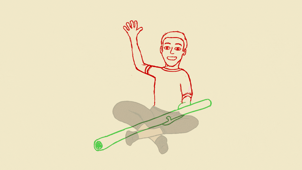
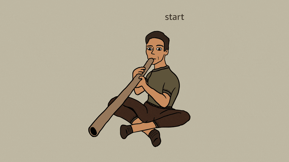
Jason's story.
Original artwork by Ailsa Walsh-Davidson
__________________________________________________________________
'The journey is about Jason going through the ups and down on having a disability, the empowerment and resilience he has in facing any negativity in his life but you can see through that he has overcome those obstacles. This holistic healing comes from being involved with NDIS, friends and family but also in his culture.'
Ailsa Walsh-Davidson.
__________________________________________________________________
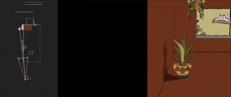
The artwork from Ailsa Walsh-Davidson has a humble genuineness to it's portrayal of Jason's world. The artwork encompasses him and the things that he loves in such clarity and vibrance - and this was something that we wanted to honour and continue into animation as much as we could. We had to think out of the box a little at times to draw correlations between the white dots and the possibility to potentially use them, along with the bean shapes, to visualise the way that even shopping and cooking is something that the NDIS has changed in Jason's world day to day. It was such a treat to be able to design Jason's home, and depict the joyous nature of simply listening to Kookaburras.
Animating Jason's didgeridoo sequence was something that we knew instantly would need to be cel animation. As much as that process is a labour of love - the time and dedication spent to ensure the movement was just right - is worth every moment.
Shanice's story.
Original artwork by Kimberley Engwicht
The artwork from Kimberley Engwicht was a nice change of scenery. Simple imagery to tell the story in a bespoke nature. We explored using actual cut out paper, photographed, and then animated verses including such anomalies manually in the digital assets. Bringing textures into play helped to support the stop motion look that we were going for. Had we more time for exploration and execution on this spot we'd have loved to shoot this whole spot as traditional stop motion animation with real world lighting effects and movements; alas, for another time!